

Every business needs a simple but professional logo on their web site to truly look professional and established.
We don't do elaborate corporate logos - we design inexpensive but effective graphic logos for web sites. However, the most effective corporate logos are the most simple as well.
There is a definite philosophy involved in logo creation. Here are some important factors:
— Logos should be elongate rectangles for web use.
- A square logo (if small) will look like a tiny postage stamp or, if large enough
to be noticed will consume too much vertical "real estate".— An effective logo is graphically very simple - simple is far more effective.
- The less there is to remember, the more is remembered.
- A logo is not meant to be a picture - it is an icon.
- Simple graphics retain details when reduced in size.
—A logo should also be effective in black and white.
- Plan for success - it might end up on a fax header or in a newspaper, etc.
—Use appropriate graphic symbolism where possible.
—A professional logo makes you look established.
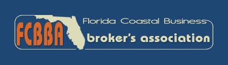
Florida Coast Business Broker's new logo |
 |
| Gas station style logo for gasstations.com |
| A spin-off on gasstations.com - Southern Asia theme in logo graphic. Click to enlarge - can you spot the symbolism in the graphic?. |  |
| Incorporated check mark into the K in check. |
| Logo for Clearwater Florida's Applied Technologies, or "AT", Group. | 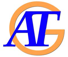 |
| The simplest, yet still quite effective, logo uses only text - but done in an artful graphic manner. |
| Click for the color version of this logo.. |  |